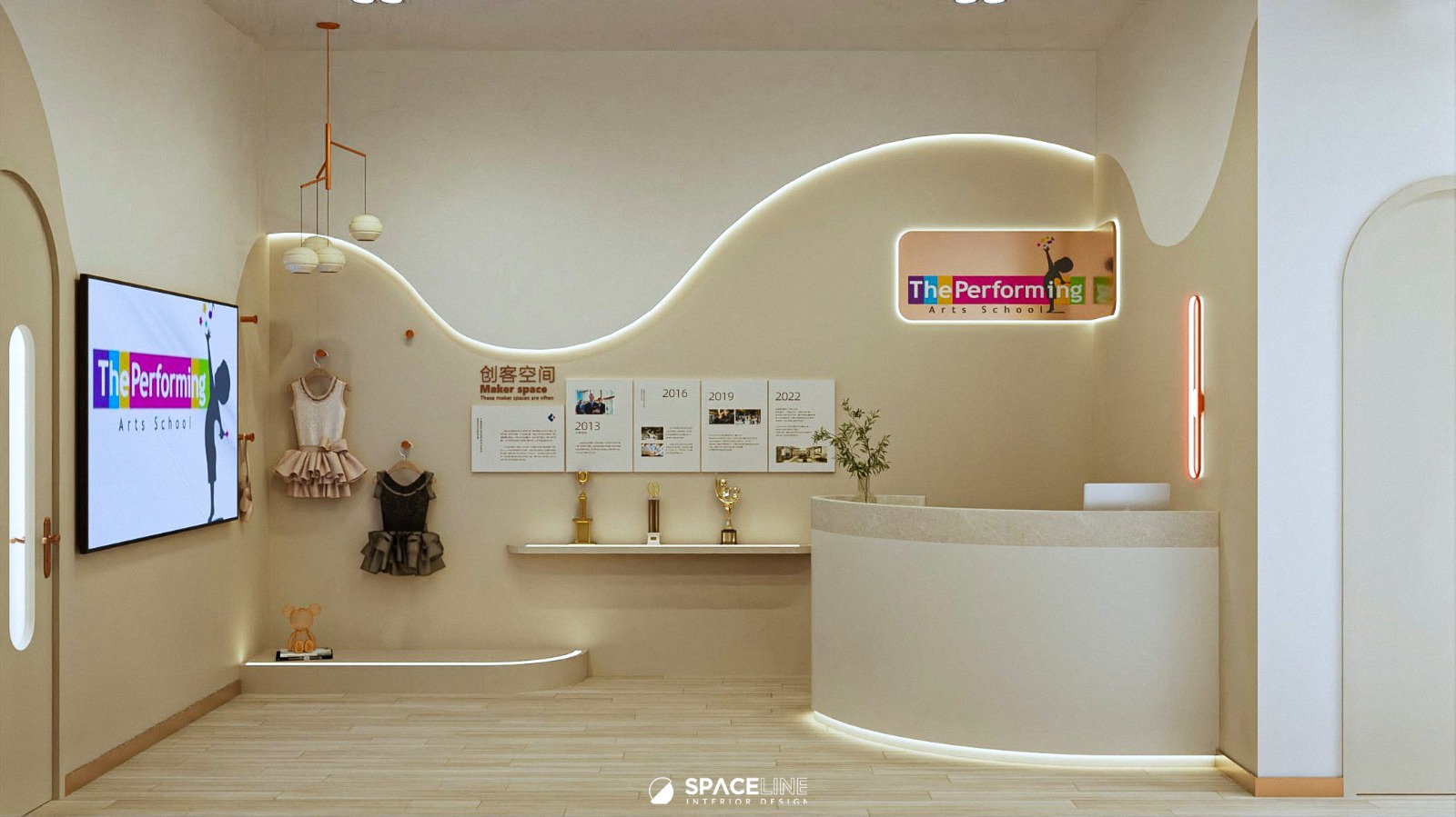
This beauty centre is a direct physical embodiment of the owner’s brand identity, utilizing a specialized color palette to create an interior space that is calming, inviting, and luxurious through softness. The design successfully leverages the high ceiling while ensuring optimized flow for client experience.
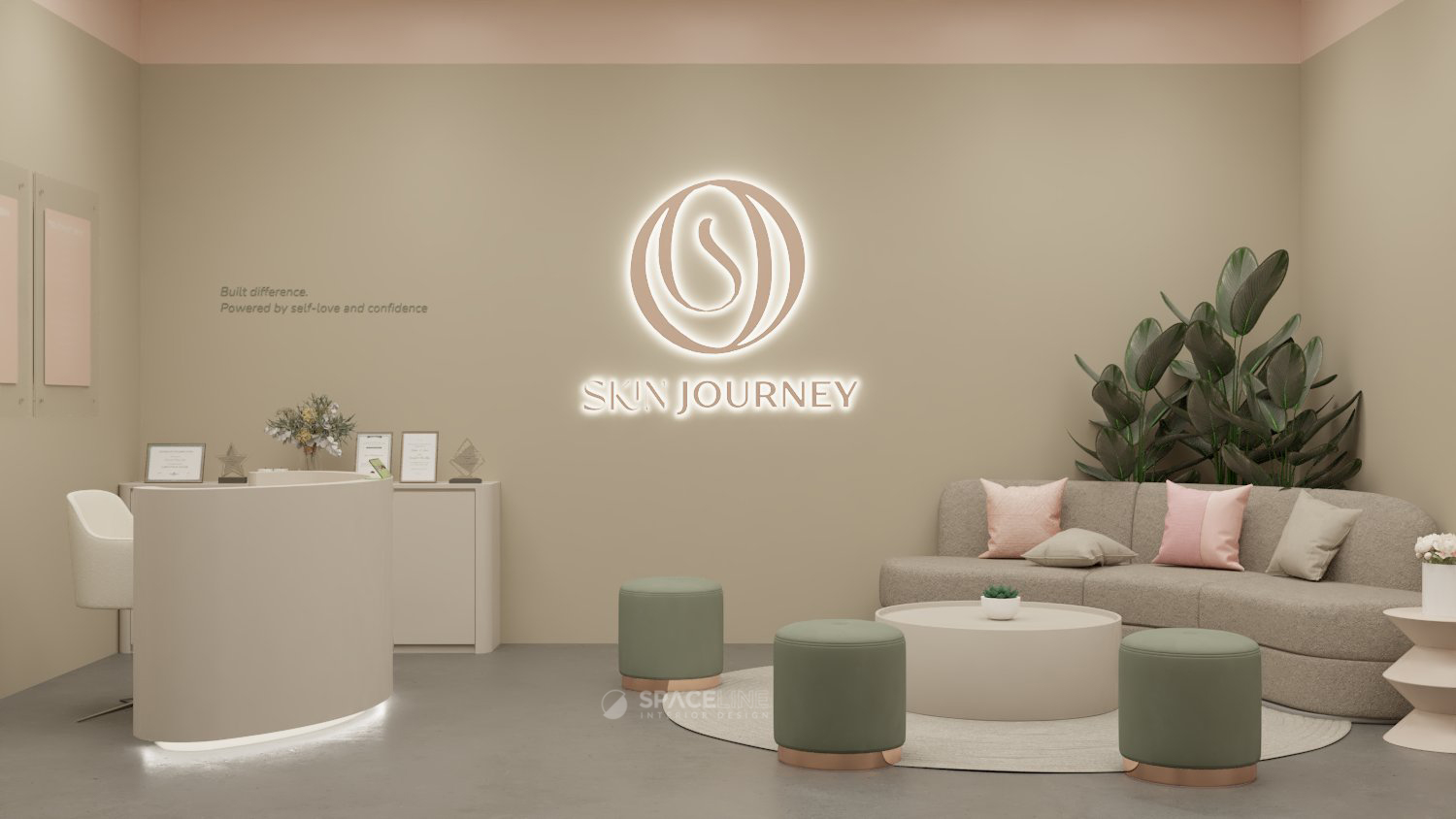
Aesthetic: Grounded Softness and Height Control
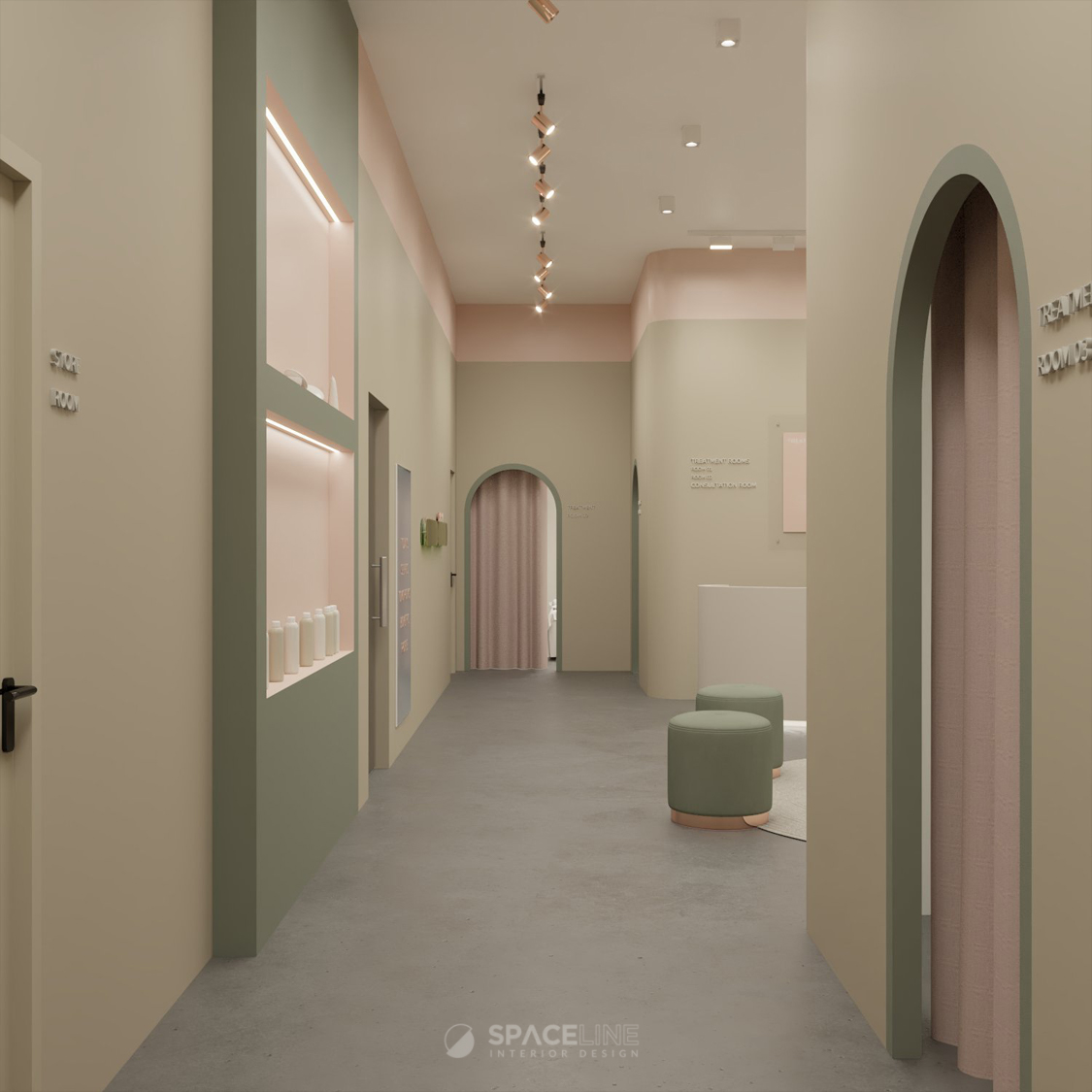
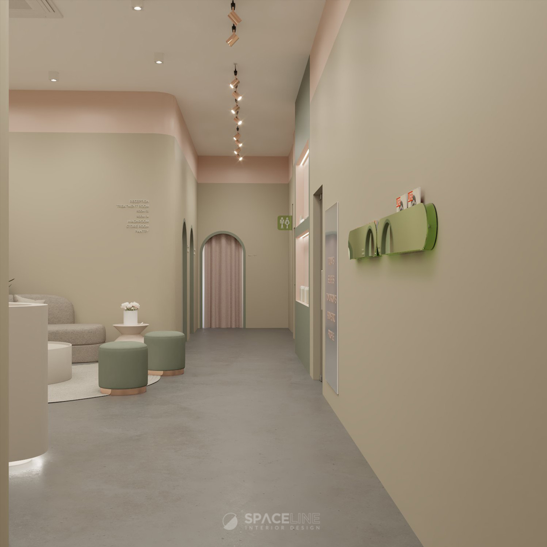
The entire space commits to the brand’s identity through an earthy and soft ambience. To manage the high ceiling without overpowering the space, a design solution using two paint colors with different height proportions was curated:
- Earth tone as the main color, offering a comforting and grounded atmosphere.
- Pastel rose tone as the secondary color, enhancing the visual aesthetic.
Accent colors, such as green, are implemented to visualize the brand’s identity and add a fresh element.
Client Experience and Zoning
The entrance is designed to introduce the brand immediately; the focal entrance wall is equipped with a large brand logo highlighted with an LED backdrop.
For seamless client experience, a recessed display storage for products is placed near the entrance and waiting area. The layout zoning is designed to ensure easy visitor movement and avoid overcrowding during peak hours. A key feature is the strategic placement of the waiting and treatment rooms, ensuring a reachable distance and reducing hassle.All treatment rooms are curated with a semi-arch doorway featuring a green border to clearly indicate the space function while offering a friendly, welcoming vibe to customers. The overall peaceful ambience invites visitors to slow down, unwind, and experience luxury in the form of design softness.